Monthly Archives: May 2011
Delaware Welcome Center QR Code
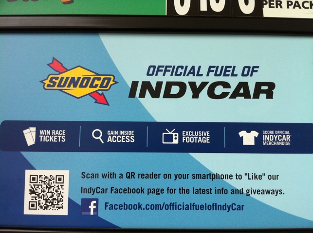
QR code in the wild! I snapped this at the Sunoco station at the Delaware Welcome Center on I-95.
make sure they are the RIGHT thousand words
I recently came across an RSS feed about do-s and don’t-s of web site design and one of the points that they made was that the ornamental design element and irrelevant stock image actually detracts from the user experience. I couldn’t agree more, with the operative word being irrelevant. I have many small business clients… More
a UX anatomy of evil
Here is an example of great user-centric design. I saw this commercial for Money Mutual, a non-bank lending institution (they make Wall Street look like choirboys) with a very official-sounding name and an oddly familiar logo. Here is a screen shot from their website: Yes, that’s Montel Williams. I’ll save him for another post. Right… More
Shock and aww
So I was engaged in a conversation earlier today about User Experience, UX for short. This, along with User Interface (UI) design, are the hot button topics of web design now. Suddenly, companies care about their users now that the web has evolved and flattened so that users have a say in how they interact… More
How close is too close?
So here is a client relations issue that many of us small business-facing creatives have: Getting too close to your client. Generally, my small business clients are usually run by a single person. That person usually has the chops to run a business and sell him/herself to the general public. One of the reasons that… More
It’s a knockout
An often overlooked logo design element is the knockout version. The knockout is the version of the logo that would appear on a dark background. There are many times when a logo cannot be reproduced in full color due to the environment where the logo will be placed or the costs associated with printing in… More
I’m in the mood (board)
Recently I asked my peers on LinkedIn.com about their opinion on the use of mood boards. There was a mixed response. Some were fully in support, others thought that it was an unnecessary step in the development of a design project. I’ve made a decision: mood boards are essential steps in the creative process. One… More
A little something about color
I haven’t written anything here yet about color, but this is a fascinating article about how men and women perceive color. It’s definitely something to consider when coming up with your creative or brand strategy. The one revelation that this study made was that 26% of all respondents stated that orange was a “cheap” color.… More
Deal-breaker
So how many times has this happened to you: You want some information from a company’s website. They tell you that it is free, but then WHAM. You get hit with a form that asks for way more information than you are prepared to give for a 5-page PDF on whatever. And. you. bail. This… More
QR Codes: a powerful communications tool for small businesses
So here is an article about a big brand, Glamour magazine, using QR codes to allow users to “like” the Facebook pages of their advertisers. Seems really cool and breathes new life into an “old” medium. The QR code contains information or can direct you to a web page, say Facebook, to get more information.… More